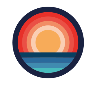
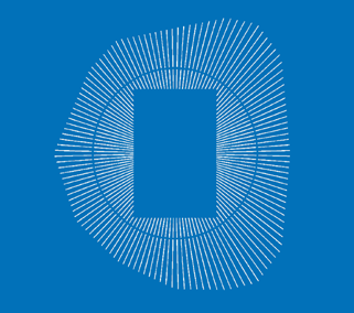
Obsidian Cloud
Identity – branding

Obsidian Cloud, a cloud-focused, part of DGKS Solutions Limited, specialises in Security Engineering and Architecture, Program and Project management, Storage Design and Engineering, Networking and Application Development.
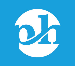
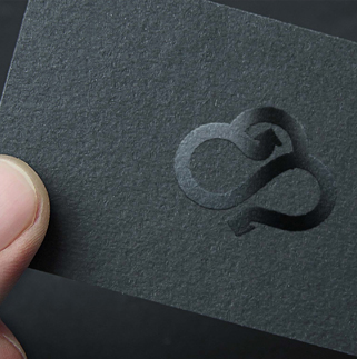
Icon: They needed a logo that represents the cloud-focused services they provide. They choose the name “Obsidian” because it is a very protective stone and it is excellent protection against psychic attacks. They were quite specific on what the direction they wanted to follow in terms of the icon – protection and solutions. I have tried to implement their vision to a fresher abstract look.
Typography: I wanted to create a clear modern serif but contemporary at same time font. Lowercase type is positioning a brand as being friendlier, less stiff/formal and more accessible. A simple clean logo that reflects trust and professionalism.
Colour theme: The colour comes from the name itself “obsidian”. It is a natural, volcanic glass. The colour of the stone is jet black but looking it through the light, as it is glass, it gives variations of grey colour.


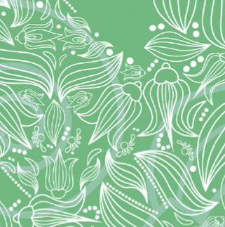
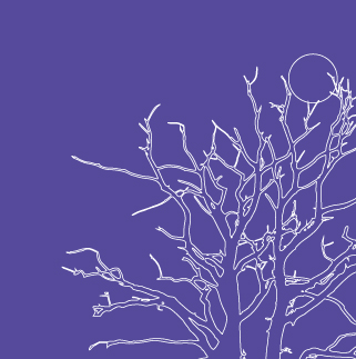
Inspired?
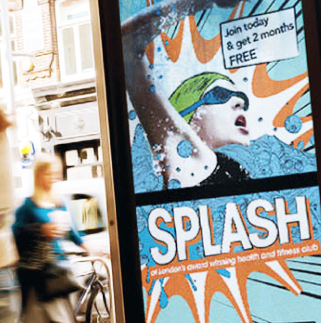
Recent Work